So how did it go?
AWC
Anil, Cadence, and Wei Yiing joined forces to study how we presented information and options to different types of users (new vs returning vs purchasers vs ...). They focused on the typical first touch-point in our web presence: the homepage, and how dynamically activated, positioned, and populated controls could improve the user journey for these groups.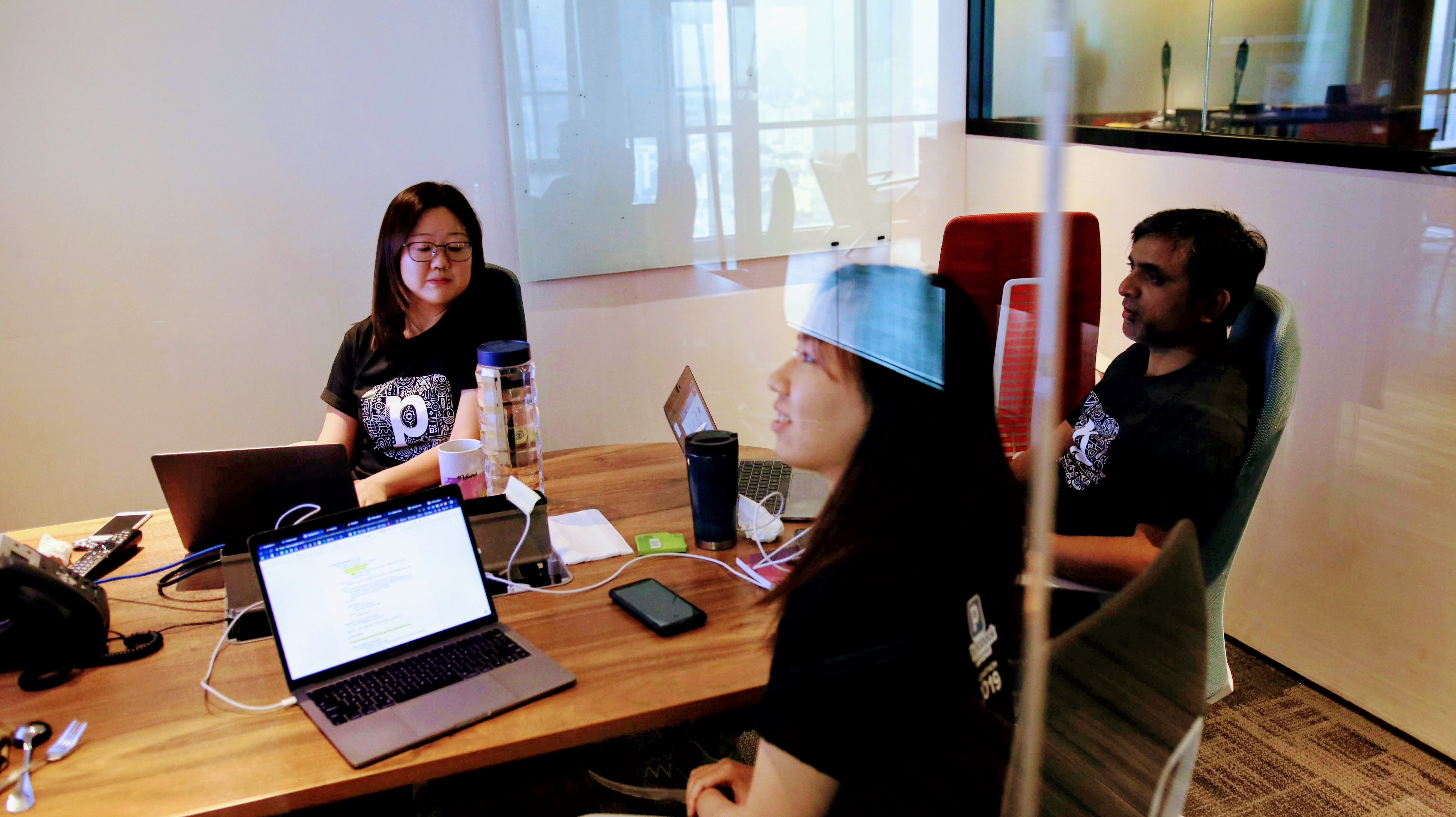
Cookies
Afiq, Adli, Danish, and Mahika demonstrated a mobile prototype that would give users the option to select photos first, after which the app would display eligible product for them to select. The idea is geared towards newer users who may not know what types of products (beyond photobooks) we offer, nor what the restrictions (minimums, maximums) on number of photographs are for these products.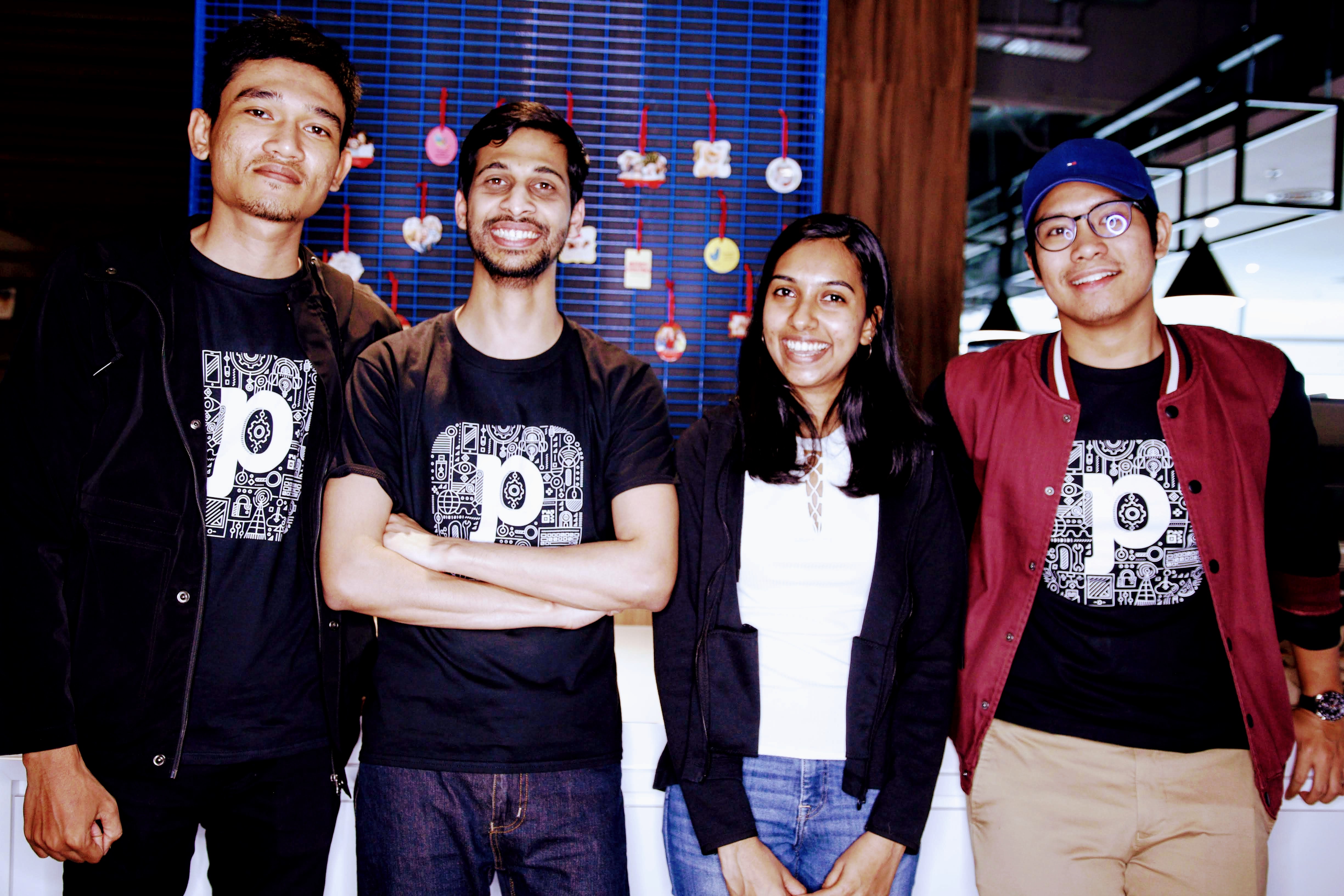
Droid
Akmal, Azri, Dali, and Dony collaborated on a rules based assistant (think "clippy," but not annoying nor interruptive). Given the compact nature of native mobile apps, and the complexity in all the options our users have to customize their items, there are certain types of users who would benefit tremendously from some form of information and instruction at their fingertips.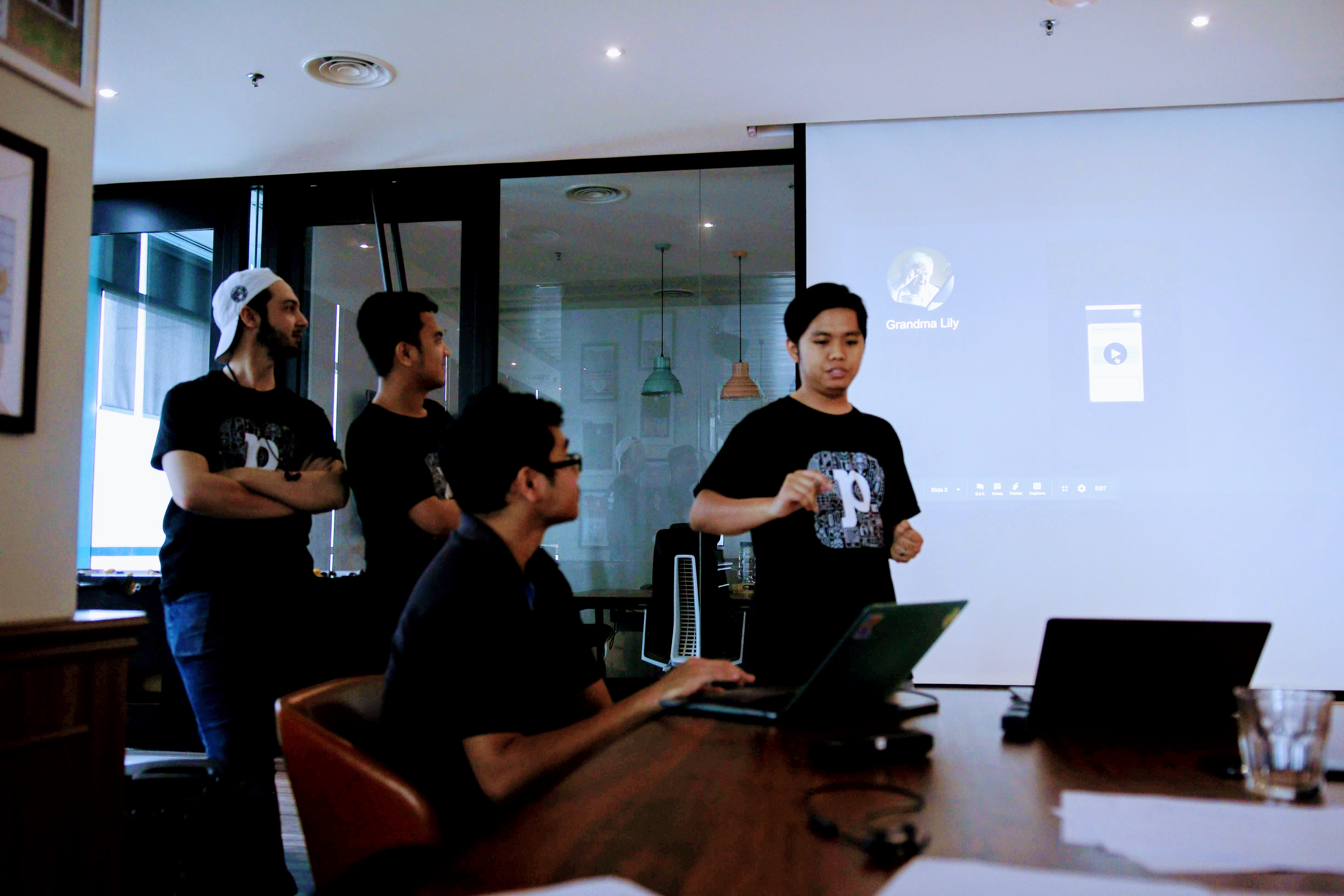
Honda Lagenda R15
Afiq, Hatim, Ikram, and Panji got together to build and demonstrate a new product information / pricing / configuration page, taking 2-3 steps in our current process and combining them into one, with attractive options to guide users to "most popular" or "promoted" options, while showing real-time effects on pricing. As with any ecommerce UX, generically, the less steps the better, and the clearer the journey the better.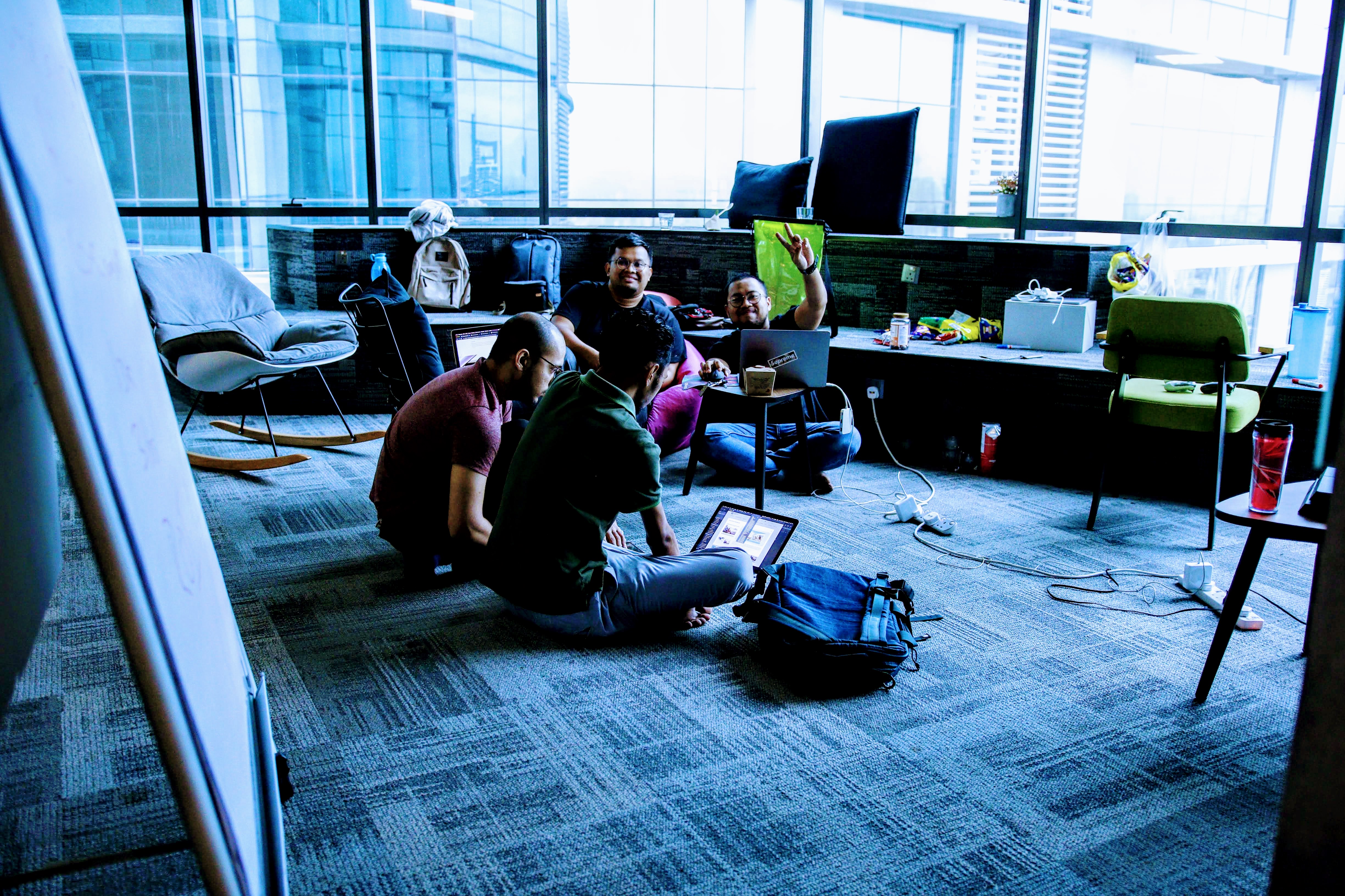
Tukang Kod
Alvin, Cumba, Fikri, and Salman delivered a two-pronged demo, on one end focusing on voucher redemption, allowing the users to avoid disappointment (of mismatched vouchers / products) by starting with the code and driving the user to edit the appropriate product for that code; and on the other end utilizing image recognition and categorization to suggest relevant templates, reducing the time needed to select the right one.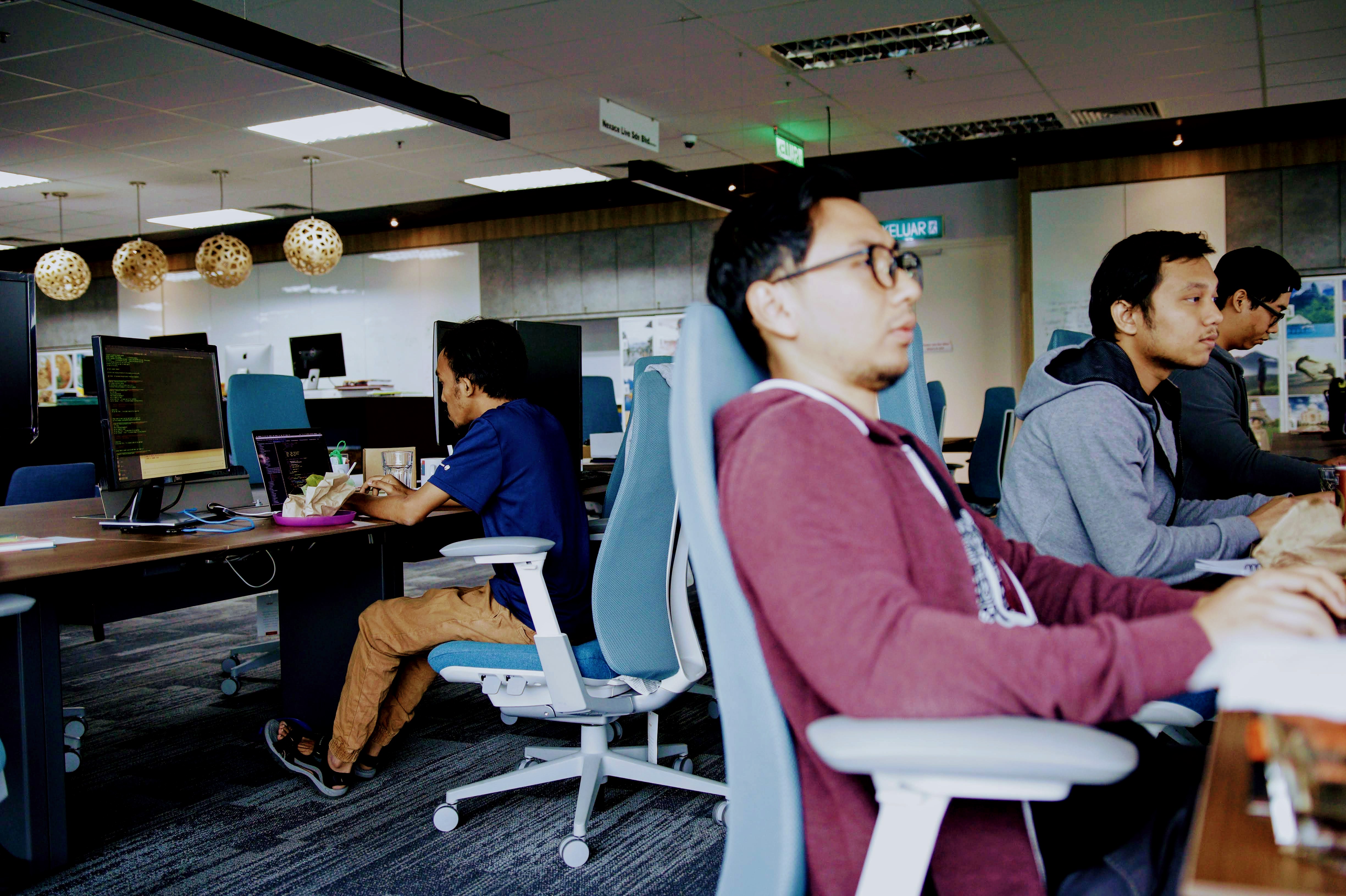
Two and a Half Men
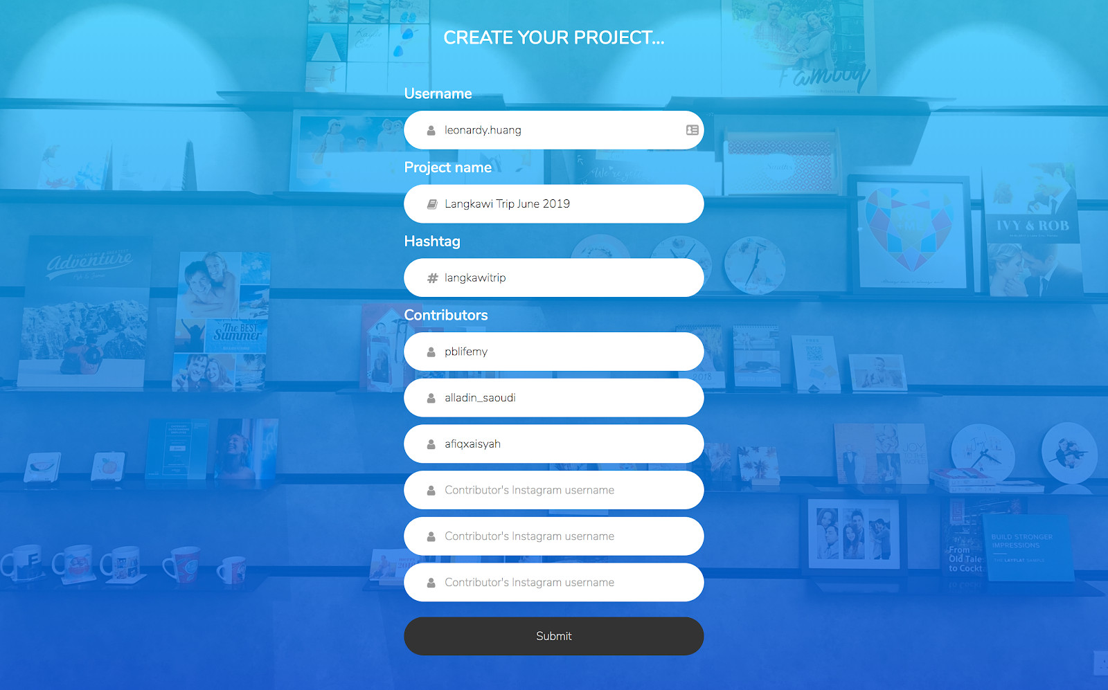
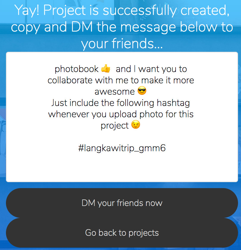
Afiq (yes we have 3), Alladin, and Leo worked on a functional demo of a brand new user journey that enables users to print our new "lil' photobooks" collaboratively from instagram pictures with minimal pain. They also allow for users to be assigned to projects, so the pictures shared in the book are from folks you know, not random strangers.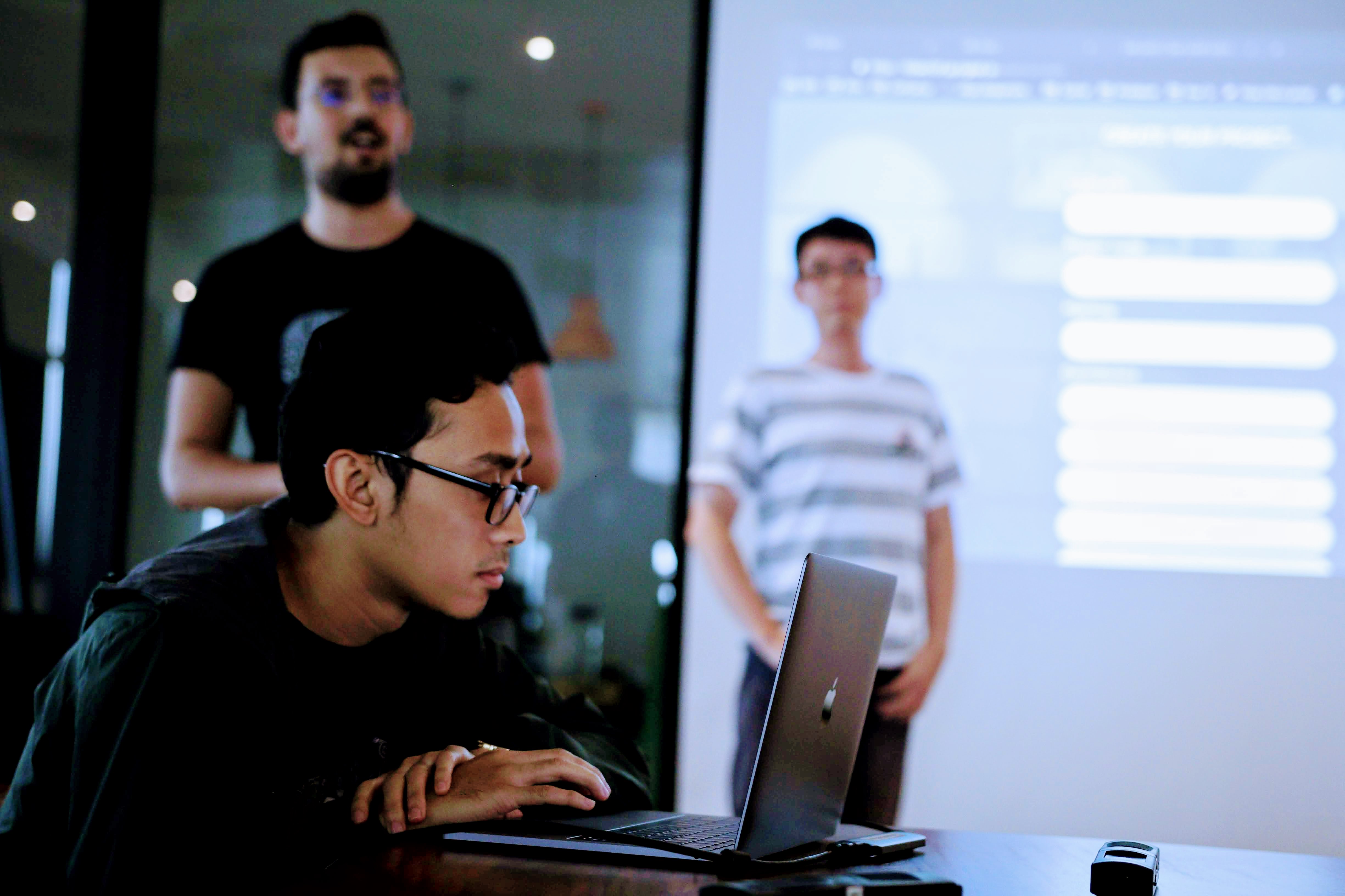
So who won?
All in all, I believe we have 6 viable projects to consider for upcoming roadmap. I know all the judges and participants would agree this was a great outcome, and I can't wait to do it again.
Runner up team: Cookies! They each received a Garmin Vivosmart 3 Sport Watch (Danish, we're holding yours for when you return from vacation).
In their own words:
Project Title: For You Album
Aim: Providing a customer-first experience by minimizing the number of steps to explore different products offered
And the winning team: Two and a Half Men! Each taking home a PS4!
In their own words:
Idea
PB-Insta - new PB feature to use Instagram as a sharing platform for customers to create collaboration or personal projects without the hassle of using online designer or other apps.
Why Instagram
Best suitable product
Square lil’ photobook
Main features
Screenshots
Flow:
1. User goes to Photobook platform to create a project which will generate a unique hashtag
2. Unique hashtag created, user can share this hashtag to the collaborators
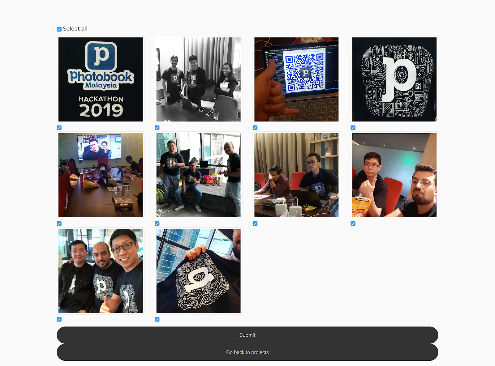
3. After all photos are uploaded with the hashtag, user can go back to project page, select the photos, and submit order (pdf will be generated)
Flow:
1. User goes to Photobook platform and log in using Instagram (to get permissions to access user’s photos)
2. Select the photos
3. Submit order
The Last Word
The real winners are our users, who will benefit greatly when these 6 ideas materialize into features for them to use. My thanks to everyone who participated, to the judges, and to Mike Kow who organized and coordinated a great event.
